A gentle introduction to Pandas 1

Before you start

  • This is a beginner level series
  • You must be comfortable with python, I will be using python 3.5x
  • exposure to jupyter notebooks and numpy is a plus

What is pandas?

pandas is a Python package providing fast, flexible, and expressive data structures designed to make working with “relational” or “labeled” data both easy and intuitive. It aims to be the fundamental high-level building block for doing practical, real-world data analysis in Python. …from pandas documentation

In a more simpler way, pandas library provides us with a way to interact with our data which can be visualized as an excel worksheet, labelled and organized in rows and columns.

This post will cover

  • Installing and importing pandas
  • Basic data-structure in pandas
  • Using pandas Series

Installing and getting started

  • option1: you can install pandas using pip install pandas
  • option2: you can install Anaconda which is a collection of libraries for data and scientific computing. Pandas is included in the collection

You can import pandas just as you import any other module in python using the import statement.


import pandas as pd

You can also see the jupyter notebook on google colab

Building Blocks of Pandas

Pandas has two fundamental data structure, series and dataframe. Series is a one dimensional labeled array which can hold any kind of data. DataFrame, on the other hand, is two dimensional very close to what we are already used to with excel. In this first post on pandas we will be looking at Series object.

Creating a pandas Series object

  • creating series from python list
  • creating series from python dict
  • creating series from numpy ndarray
We will use constructor function Series in pandas library and give it a python list which we want to convert into pandas series object. We can optionally provide labels which will be the index. Pandas automatically generate the index from an integer range.
# importing pandas library
import pandas as pd

# Creating series object from lists

# series has two elements data and labels
myNums = pd.Series([1,2,3,4,5,], index=['a','b','c','d','e'])
print("Pandas series object with labels declared explicitly")
print(myNums)

# If we dont provide labels pandas will automatically assign integer range labels 
myNums = pd.Series([1,2,3,4,5,])
print("Pandas series object")
print(myNums)
We can also create pandas series object from python dictionary. Unlike list dictionaries already have labels which means we don’t need to provide additional label information to series constructor.
import pandas as pd

# Pandas series object from python dictionary
mydict = {"row1": 12, "row2": 15, "row3": 20, "row4": 32}

series_from_dict = pd.Series(mydict)
print("Creating pandas series object from dict")
print(series_from_dict)

Numpy and pandas work very well together. We can easily convert a numpy array into a panda object.

import pandas as pd
import numpy as np

numpy_array = np.random.randn(10)
np_series = pd.Series(numpy_array)
print("pandas object from numpy")
print(np_series)

Accessing data from Series object

We can access the data in the series using square brackets like lists and numpy array. While accessing data we can either use the positional indexing or the labels. We can also perform the slice operation on series data object as with lists in python.

import pandas as pd

fruit_series = pd.Series( [11,23,45,54,67], 
            index = ['banana','orange', 'apple', 'strawberry', 'grapes'])

# Accessing the data using the positional index
print("price of banana: {}".format(fruit_series[0]))

# Accessing the data using the label
print("price of banana: {}".format(fruit_series["banana"]))

# Accessing the data using slices
print("first two fruits in the list")
print(fruit_series[0:2])

Operations on Series

We can perform basic mathematical operations on series objects. When we are operating on two series objects the operations will be carried out between data at same index on both series. Let me give you an example
series1 = pd.Series([1,2,3,4])
series2 = pd.Series([5,6,7,8])
series1 + series2
above operation will result in new series object where
[series1[0]+series2[0], series1[1]+series2[1],…series1[n]+series2[n]]
In case the length of the two series are not equal then the index where there is no data will have NaN. If we carry out an operation on series with a scalar (for example multiply series with a number), data at every index will be multiplied by that number.
import pandas as pd

# We are going to use the same fruit data
fruits = pd.Series([11,23,45,54,67], 
          index = ['banana','orange', 'apple', 'strawberry', 'grapes'], 
          name = "fruits")

# Scalar operations
# Let's say we want to offer 10% discount on all our fruits.
# in pandas we can use mathematical operations 
# with any scalar and that will be applied to every data item
discounted_fruits = fruits * .9
print( "discounted price through scalar multiplication")
print(discounted_fruits)

# we can also store the discount amount in new series object
ten_percent_discount = fruits * .1

# and subtract the two series as long as the lengths are equal
discounted_price = fruits - ten_percent_discount
print( "discounted price by subtracting two series obj")
print(discounted_price)

more coming soon…

Plotting in python

Matplotlib, Plotting in Python – 2

Previous Post in the Series (Matplotlib, Plotting in Python – 1)

Bar Charts

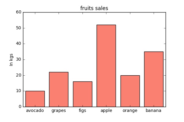
bar chart or bar graph is a chart or graph that presents categorical data with rectangular bars with heights or lengths proportional to the values that they represent. The bars can be plotted vertically or horizontally.

A bar graph shows comparisons among discrete categories. One axis of the chart shows the specific categories being compared, and the other axis represents a measured value. Some bar graphs present bars clustered in groups of more than one, showing the values of more than one measured variable. (wiki)

# Import Library
import matplotlib.pyplot as plt

%matplotlib inline

# Organize Data
# Sales of fruits in kgs for a fruit vendor
sales = [10, 22, 16, 52, 20 , 35]
items = ['avocado', 'grapes', 'figs', 'apple', 'orange', 'banana']

# bars are by default width 0.8, so we'll add 0.1 to the left coordinates # so that each bar is centered
xs = [i + 0.1 for i, _ in enumerate(items)]

# Plot

plt.bar(xs, sales, color="salmon")
plt.ylabel("In kgs")
plt.title("fruits sales")

# label x-axis with fruit names at bar centers
plt.xticks([i + 0.5 for i, _ in enumerate(items)], items)

# You can also use range function to get the index
# plt.xticks([i + .5 for i in range(len(items))], items)

plt.show()

fruit_bar

There are a few new things here from the first chart we created in the first post. Bar chart creates boxes which are (0.8) wide by default. We are trying to centre them using xs = [i + 0.1 for i, _ in enumerate(items)]. As we have used the x-location to place our boxes we have to use xticks function to place labels at a specific position on the x-axis.  xticks([0.5, 1.5, 2.5, …], [ ‘avocado’, ‘grapes’, ‘figs’, … , ‘banana’])

Histograms

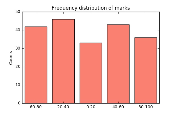
A histogram is a plot that lets you discover, and show, the underlying frequency distribution (shape) of a set of continuous data. This allows the inspection of the data for its underlying distribution (e.g., normal distribution), outliers, skewness, etc. A histogram is constructed from a continuous variable you first need to split the data into intervals, called bins. Once we have our bins we can then plot is exactly as we plotted bar-chart above.

import numpy as np
from collections import Counter
import matplotlib.pyplot as plt
%matplotlib inline

# numpy randint function to generate 200 random integers between 0 and 100
# numpy.random.randint(low, high=None, size=None, dtype='l')
marks = np.random.randint(0, high = 100, size= 200)

# Binning Function
# returns num 0, 20, 40,.. 80
def bin(num):
    return (num//20)*20

binned_count = Counter(bin(mark) for mark in marks)
# binned_count --> Counter({0: 38, 20: 37, 40: 37, 60: 50, 80: 38})

# plotting
plt.bar([x+2 for x in binned_count.keys()], binned_count.values(),  16, color="salmon")
plt.xticks ([x+10 for x in binned_count.keys()], ["0-20", "20-40", "40-60", "60-80", "80-100"])
plt.title("Frequency distribution of marks")
plt.ylabel("Counts")
plt.show()

Histogram

I was a bit lazy to type out hundreds of data points so I went for numpy function randint to generate 200 numbers between 0 and 100. I have then used counter and bin function to bin these numbers in buckets of values range (“0-20”, “20-40”, “40-60”, “60-80”, “80-100”). Once we have this then we plot as we have done with bar-chart. Another thing to note here is that 16 in << plt.bar([x+2 for x in binned_count.keys()], binned_count.values(), 16, color=”salmon” >> is the width of the box.

We can also do the built-in hist function to generate the histogram. The exercise above was just to understand binning.

# import libraries as we have done before 
marks = np.random.randint(0, high = 100, size= 200)

# plotting
plt.hist(marks, bins=5, color="salmon")

plt.title("Frequency distribution of marks")
plt.ylabel("Counts")
plt.show()

Next Post

  • Line charts
  • Scatterplots
  • Box plots
Plotting in python

Matplotlib, Plotting in Python – 1

Visualising Data

As a data science person, it is vital that you are able to produce meaningful visualisations. There are two good reasons to use visualisations, first to explore our datasets and second to communicate. While the first part might be easier, second one can get quite complicated depending on who you wish to communicate with.

There are a wide variety of tools available for data visualisation in python. I am going to use Matplotlib to demonstrate some basic features and plots you can generate using the tools that come with it. We will be using module pyplot in the Matplotlib library to generate plot and to display or save them.

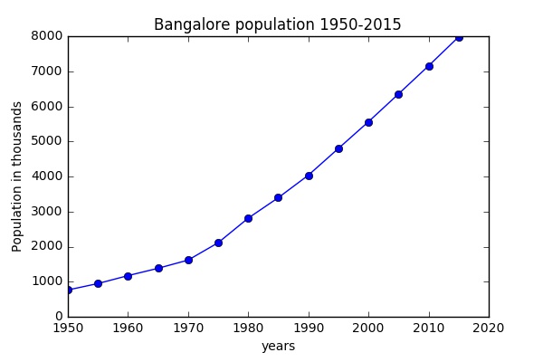
Let’s begin by plotting something. I have population data for Bangalore (1950 to 2015). I will plot the growth using matplotlib and then I will discuss it stepwise.

#IMPORTING THE LIBRARY
import matplotlib.pyplot as plt
%matplotlib inline

# GETTING DATA READY
population = [764,947,1173,1382,1616,2111,2812,3395,4036,4799,5561,6354,7155,7981]
year = [1950,1955,1960,1965,1970,1975,1980,1985,1990,1995,2000,2005,2010,2015]

# GENERATING PLOT
plt.plot(year, population, marker="o", linestyle = "solid")
plt.title("Bangalore population 1950-2015")
plt.xlabel("years")
plt.ylabel("Population in thousands")

# DISPLAYING/ SAVING THE PLOT
plt.plot()
plt.savefig("bangalorepopulation.jpg")

This will produce a plot very similar to the one below.

bangalorepopulation

Step 1: Importing matplotlib Library

This is similar to importing any other python library, nothing out of normal here. We import matplotlib.pyplot as plt just because it is easier to use the alias. You will notice the statement ” %matplotlib inline”, ignore it if you are not using jupyter notebook. If you are using notebook then this statement just ensures that the plots are displayed in the notebook.

Step 2: Getting Data Ready

We are providing formatted data to plot function as list objects. We will in future also use numpy arrays and pandas series objects. Remember to have homogenous data and that data values and labels are of same list/number. In our case, we have two lists population and years. We are plotting population figures for the corresponding year label.

Step 3: Generating Plot

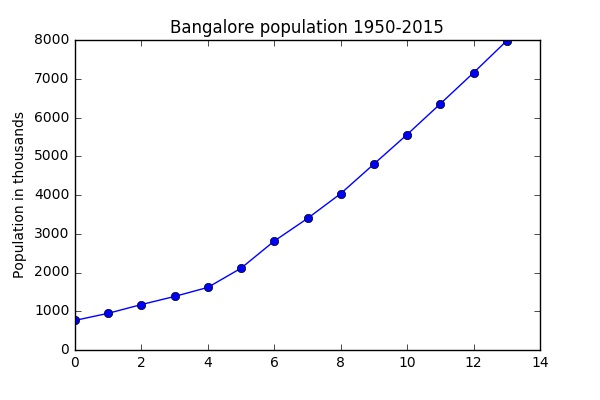
Plot function takes data and other input for styling the plot. The syntax being plt.plot(x-data, y-data, styling options… ). We will see styling in detail in later posts. We can also plot with just data and no labels in that pyplot will assign an integer range as x labels.

<span id="mce_SELREST_start" style="overflow:hidden;line-height:0;"></span># if we only provide y data
plt.plot(population, marker="o", linestyle = "solid")

bangalorepopulation1.jpg

Step 4: Saving or Displaying The Plot

Show function displays the plot while savefig function saves the plot as an image to the specified location and as given filename.


In next post

We will look at different types of plots

  • Bar Charts
  • Histograms

Building Automation- Introduction

Taken from my lecture, building automation and IoT for Architects and Designers, 2018

What is Building Automation?

Building automation is monitoring and controlling a building’s systems including mechanical, security, fire and flood safety, lighting, heating, ventilation, and air conditioning. Such systems can

  • keep building climates within a specified range,
  • light rooms according to an occupancy schedule,
  • monitor performance and device failures in all systems, and
  • alarm facility managers in the event of a malfunction.

Building automation most broadly refers to creating centralized, networked systems of hardware and software monitors and controls a building’s facility systems (electricity, lighting, plumbing, HVAC, water supply, etc.). When facilities are monitored and controlled in a seamless fashion, this creates a much more reliable working environment for the building’s tenants. Furthermore, the efficiency introduced through automation allows the building’s facility management team to adopt more sustainable practices and reduce energy costs.

In addition to  basics of the building automation systems, in this series we will discuss components, sensors and IoTs which will not only help us manage but give us great insights as designers.

Main Functions of Automation in Buildings

These are the four core functions of a building automation system:

  1. To control the building environment
  2. To operate systems according to occupancy and energy demand
  3. To monitor and correct system performance
  4. To alert or sound alarms when needed

At optimal performance levels, an automated building is greener and more user-friendly than a non-controlled building.

What are we controlling?

A key component in a building automation system is called a controller, which is a small, specialized computer. We will explore exactly how these work in a later section. For now, it’s important to understand the applications of these controllers. Controllers regulate the performance of various facilities within the building. Traditionally, this includes the following:

  • Mechanical systems
  • Electrical systems
  • Plumbing systems
  • Heating, ventilation and air-conditioning systems
  • Lighting systems
  • Security Systems and Surveillance Systems

In all of the systems above we will have a some device to measures/sense a events/environment, a communication link to transmit this data, a controller device to analyze this data and take action and finally some storage device to store the data and information about actions.

Let me explain that with a simple example of automated light system which adjust the level of brightness based on the time of day and how bright it is outside.

  1. We might need a sensor to measure the brightness in the room
  2. We will need to connect the output from the sensor  to a controller device, maybe through a cable or network or internet
  3. Controller device might just be a simple microcontroller which contains a program which decides actions to corresponding levels of brightness
  4. We would also like to store the data someone so that we can decide whether it measure the effectiveness or our system. We can connect the controller to a SD card and write data to it.


We will examine each of these steps in details in future lessons. I will try to keep it to the concepts to begin with.

Plotting in python

Matplotlib, Plotting in Python – 3

Previous post in the series [Plotting in Python- 2]

In this post we will look at

  • Line Charts
  • Scatter plots

Line Charts

We have already seen line chart before in the first post in the series. Here I added additional city to our initial population plot. We can add several plot to our figure. You should try to style the plot differently and also add a label which is needed by the legend function. we will see these plots again later when we start exploring some real datasets for analysis.

import matplotlib.pyplot as plt

%matplotlib inline

# Data population in thousands
pop_bng = [764,1173,1616,2812,4036,5561,7155]
pop_mum = [2967, 4152, 5971, 8227,12500, 16368, 18394 ]
year = [1950,1960,1970,1980,1990,2000,2010]

plt.plot(year, pop_bng, marker="o", linestyle = "solid", color="blue", label="Bangalore")
plt.plot(year, pop_mum, marker="o", linestyle = "solid", color="salmon", label="Mumbai")

# Additional styling
plt.title("Bangalore and Mumbai Populations")
plt.xlabel("years")
plt.ylabel("Population in thousands")

# Legend requires labels in your plot function
plt.legend()
plt.plot()

Scatterplot

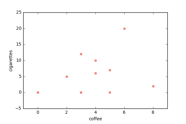
A scatterplot is the right choice for visualizing the relationship between two paired sets of data. I have made up some dummy data for relationship between number of coffee and number of cigarette consumed by individuals. Each individual survey is a data point. Note: This data is in no way representative of real world!

# Data
survey_data = [
        ('m1', 5, 2),('m2', 12, 3),('m3', 0, 0),('m4', 0, 5),
        ('m5', 0, 3),('m6', 2, 8 ),('m7', 20, 6), ('f1',0,3),
        ('f2', 6, 4), ('f3', 7,5), ('f4', 0, 0),('f5', 10, 4)
        ]

cig = []
labels = []
coffee = []
for i in survey_data:
    labels.append(i[0])
    cig.append(i[1])
    coffee.append(i[2])

# A simple plot
plt.scatter(coffee, cig, color="salmon")
plt.xlabel("coffee")
plt.ylabel("cigarettes")
plt.show()

cigarettes_coffee

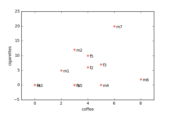
We can also loop over datapoints and add annotations to each data point with the label. There lots of cool things we can do with annotations we will see later.

plt.scatter(coffee, cig, color = "salmon")

# Annotation, labels for each point
for i in survey_data:
    plt.annotate(i[0], xy = (i[2],i[1]), xytext = (5,-5), textcoords = 'offset points')

plt.xlabel("coffee")
plt.ylabel("cigarettes")
plt.show()<span data-mce-type="bookmark" id="mce_SELREST_start" data-mce-style="overflow:hidden;line-height:0" style="overflow:hidden;line-height:0;"></span>

cigarettes_coffee_anno

Next post in series more Matplotlib

Building Automation- Why ?

The benefits of building automation are manifold, but the real reasons facility managers adopt building automation systems break down into three broad categories:

  1. They save money (medium and long run)
  2. They allow building occupants to feel more comfortable and be more productive
  3. They reduce a building’s environmental impact
  4. Improve products and experience (Iteratively)

Saving Money

The place where a BAS can save a building owner a significant amount of money is in utility bills. A more energy-efficient building simply costs less to run.

An automated building can, for example, learn and begin to predict building and room occupancy, as demonstrated earlier with the heated boardroom example. If a building can know when the demand for lighting or HVAC facilities will wax and wane, then it can dial back output when demand is lower. Estimated energy savings from simply monitoring occupancy range from 10-30%, which can add up to thousands of dollars saved on utilities each month.

Furthermore, a building can also sync up with the outdoor environment for maximum efficiency. This is most useful during the spring and summer, when there is more daylight (and thus less demand for interior lighting) and when it is warmer outside, allowing the building to leverage natural air circulation for comfort.

Data collection and reporting also makes facility management more cost efficient. In the event of a failure somewhere within the system, this will get reported right on the BAS dashboard, meaning a facility professional doesn’t have to spend time looking for and trying to diagnose the problem.

Finally, optimizing the operations of different building facilities extends the lives of the actual equipment, meaning reduced replacement and maintenance costs.

Typically, facility managers find that the money a BAS saves them will over time offset the installation and implementation of the system itself.

Comfort and Productivity

Smarter control over the building’s internal environment will keep occupants happier, thereby reducing complaints and time spent resolving those complaints. Furthermore, studies have shown that improved ventilation and air quality have a direct impact on a business’s bottom line: Employees take fewer sick days, and greater comfort allows employees to focus on their work, allowing them to increase their individual productivity.

“The value benefits average $25.00/ square foot,” writes Minnesota’s Metropolitan Energy Policy Coalition. “With decreased sick days translated into a net impact of about $5.00/square foot and increased in productivity translated into a net impact of about $20.00/square foot.”

Environmentally Friendly

The key to an automated building’s reduced environmental impact is its energy efficiency. By reducing energy consumption, a BAS can reduce the output of greenhouse gases and improve the building’s indoor air quality, the latter of which ties back into bottom-line concerns about occupant productivity.

Furthermore, an automated building can monitor and thus control waste in facilities such as the plumbing and wastewater systems. By reducing waste through efficiencies, a BAS can leave an even smaller environmental footprint. In addition, a regulatory government agency could collect the BAS’s data to actually validate a building’s energy consumption. This is key if the building’s owner is trying to achieve LEED or some other type of certification.

Improving Design

  • Data and insights from the building use can help us better our future designs.
  • Good marketing insights
  • Making space more customized to users needs
  • Making it user friendly
  • Help in strategic decision making

Building Automation- Layers and Processes

Layers/ Processes

  1. Four layers
  2. Server/Application Layer
  3. Supervisory Layer
  4. Field Controller Layer
  5. Input/Output Layer

Server/Application Layer

The server/ application layer serves to consolidate data from multiple different supervisory devices. It then delivers this data to the end user through the user interface (UI), often known as clients. The server will also store trend, alarm, and schedule data in a database. This database can be used for reporting. The final thing the server can be used for is, is for serving up the API for the building automation system.

Supervisory Layer

The supervisory layer is where the supervisory devices sit. Supervisory devices are kind of like your home router. They collect all of the traffic from the field controllers and consolidate this traffic. These devices serve to manage your communication trunks. Communication trunks allow your field controllers to connect to one another and allow your supervisory devices to collect information from the field controllers.Some supervisory devices can also act as user interfaces for the BAS. Typical features that exist in the supervisory device are:

  • User interfaces
  • Trending, scheduling, alarming
  • Global logic
  • Communication management

Field Controller Layer

Field controllers look at data from inputs (temperature sensors, switches, etc) and then control outputs (actuators, relays, etc). BAS companies will use programming tools (usually developed by the BAS vendor) to program these field controllers. The programs will look at what the inputs are doing and then will control the outputs.

Input/Output Layer

The final piece of the puzzle is the input and output layer. This is where the sensors and control devices exist. There isn’t a ton to add here except that you are starting to see IP-enabled sensors that use Ethernet or Wi-Fi for their communications. These kind of sensors will require a completely different approach and as of the time I wrote this article, it’s yet to be seen how all of this will shake out.

Building Automation- Components

Basic BAS have five essential components Sensors, Controllers, Output Devices, Communication Protocols, Dashboard and User Interfaces
Sensors: Devices that measure values such as CO2 output, temperature, humidity, daylight or even room occupancy.
Controllers: These are the brains of the systems. Controllers take data from the collectors and decide how the system will respond. Controllers are the brains of the BAS, so they require a little more exploration. As mentioned above, the advent of direct digital control modules opened up a whole universe of possibilities for automating buildings.

Output devices: These carry out the commands from the controller. Example devices are relays and actuators.

Communications protocols: Think of these as the language spoken among the components of the BAS. A popular example of a communications protocol is BACnet.

Dashboard or user interface: These are the screens or interfaces humans use to interact with the BAS. The dashboard is where building data are reported.


Building Automation- Terms and Concepts

Building Management System (BMS) and Building Control System (BCS)

These are more general terms for systems that control a building’s facilities, although they are not necessarily automation systems.

Building Automation System (BAS)

A BAS is a subset of the management and control systems above and can be a part of the larger BMS or BCS. That said, building management and building automation have so thoroughly overlapped in recent years that it’s understandable people would use those terms interchangeably.

Energy Management System (EMS) and Energy Management Control System (EMCS)

These are systems that specifically deal with energy consumption, metering, etc. There is enough overlap between what a BAS does and what an EMS does that we can consider these synonymous.

Direct Digital Control (DDC)

This is the innovation that was brought about by small, affordable microprocessors in the ‘80s. DDC is the method by which the components of a digital system communicate.

Application Programming Interface (API)

This is a term common in computer programing. It describes the code that defines how two or more pieces of software communicate with one another.